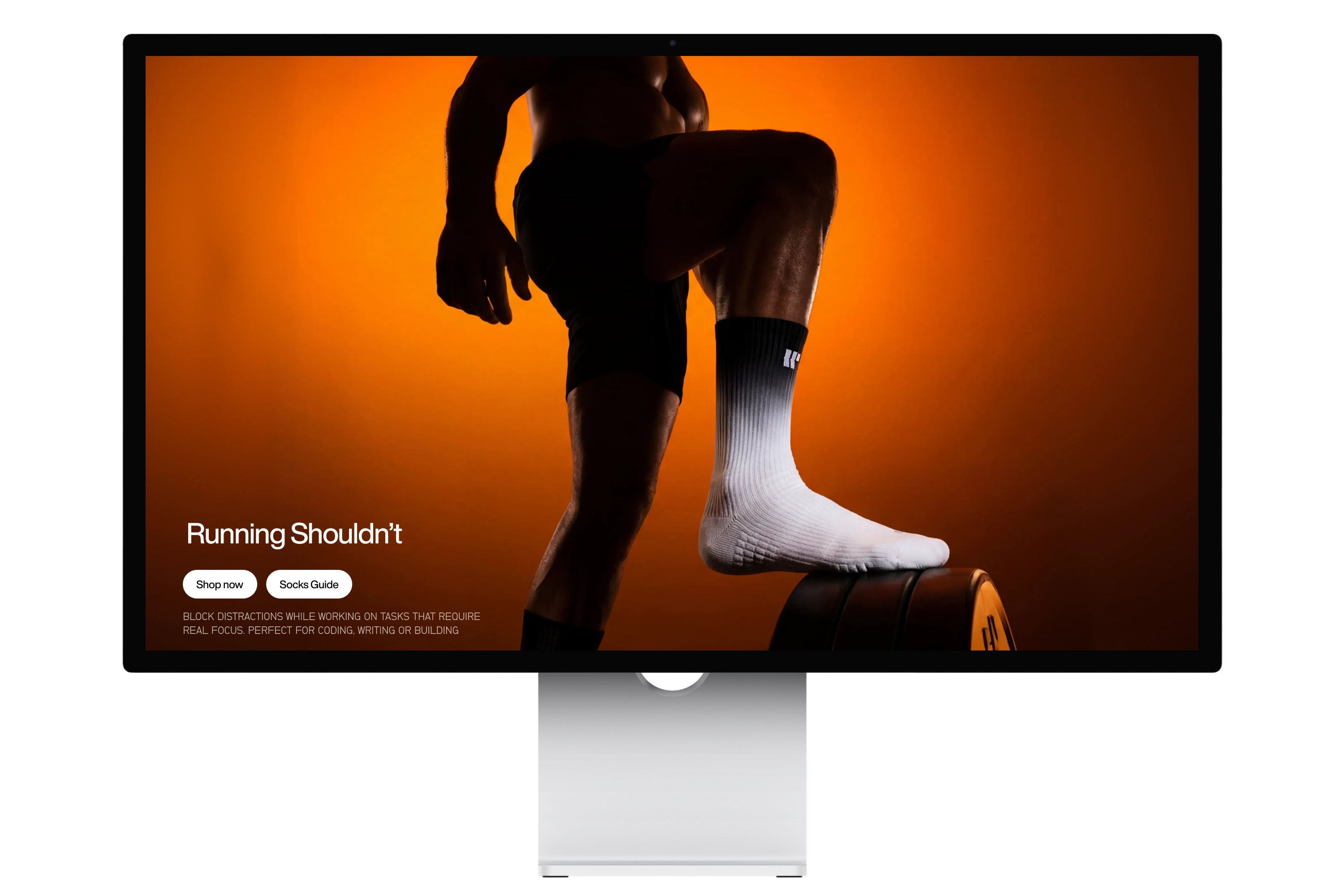
Every runner knows the feeling. The shin splints, the swelling, the fatigue that builds up mile after mile. Wethlete was built around one idea: it doesn't have to be this way.
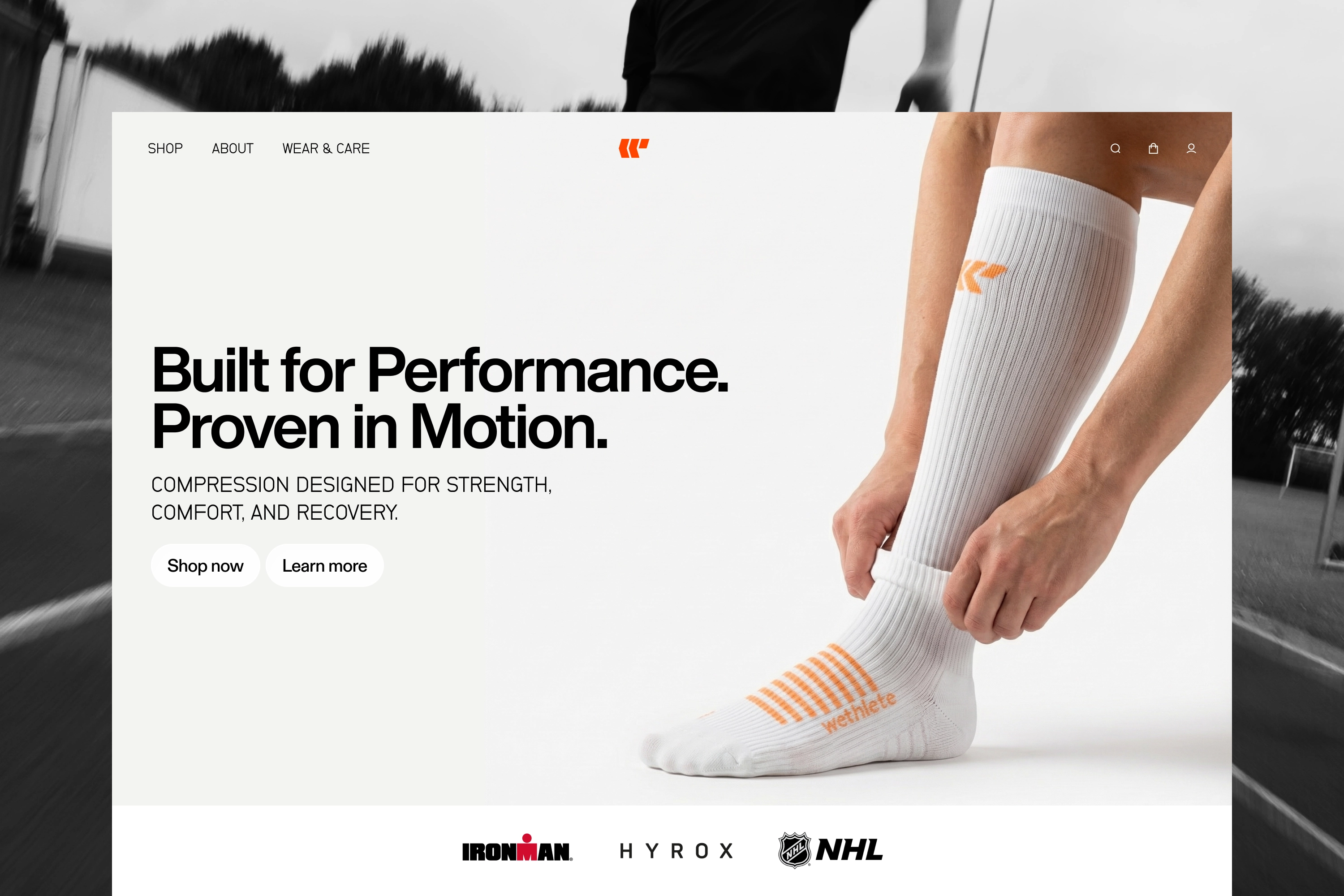
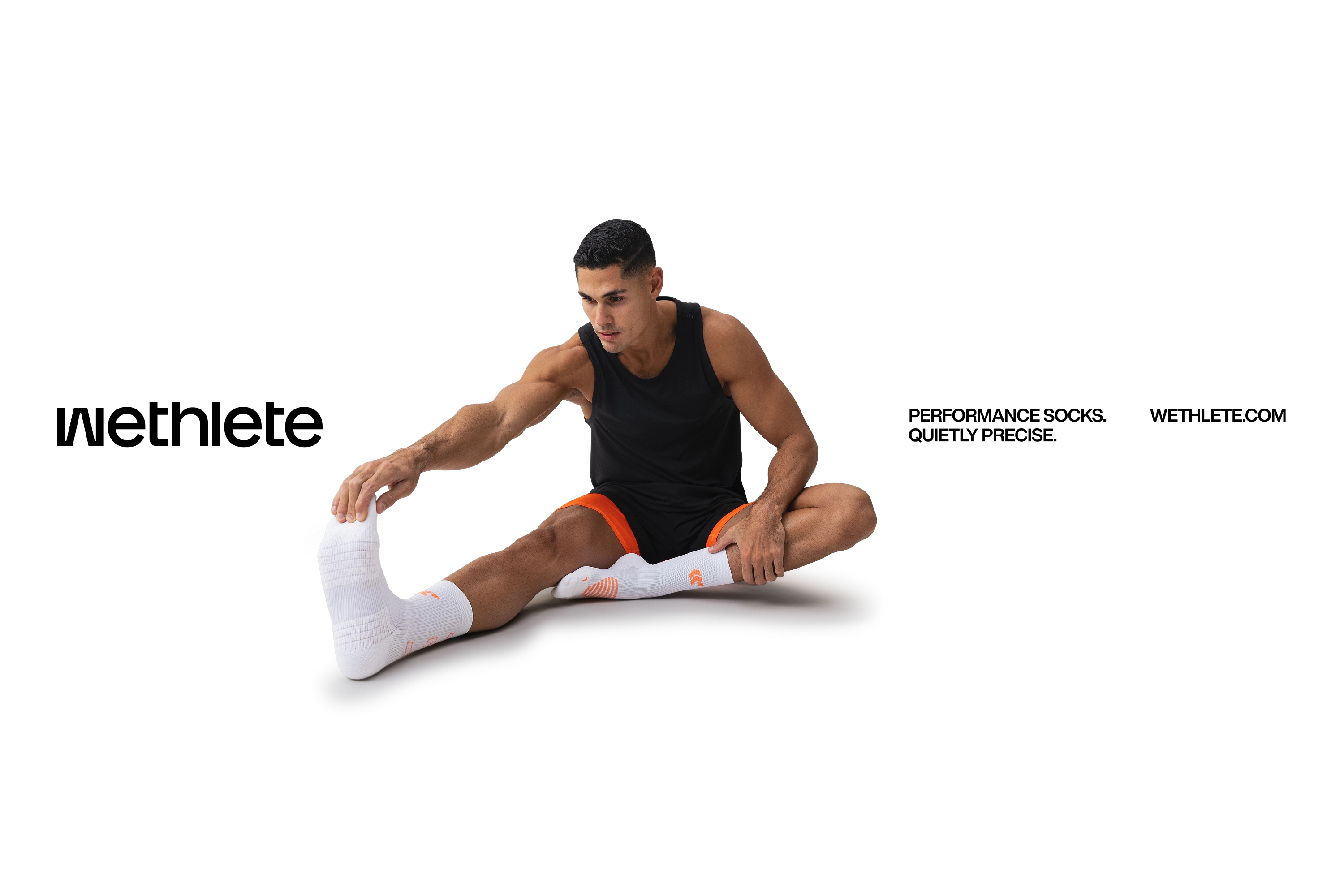
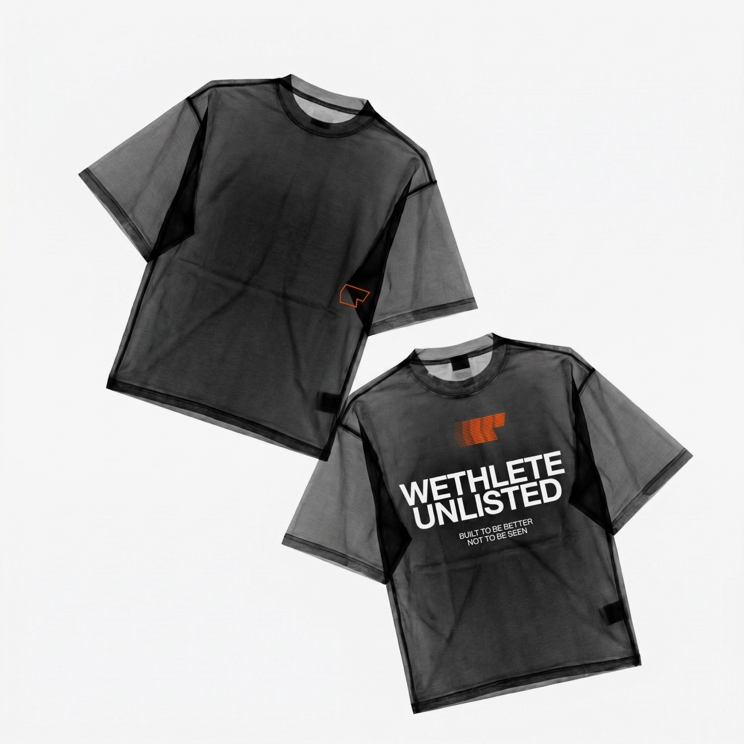
Wethlete started with a simple question: why do most compression socks look like medical equipment? The answer shaped the entire brand. Performance gear that runners actually want to wear. From identity to product to campaign, every decision came back to that tension between function and feeling.
Built to perform.
Designed to disappear.
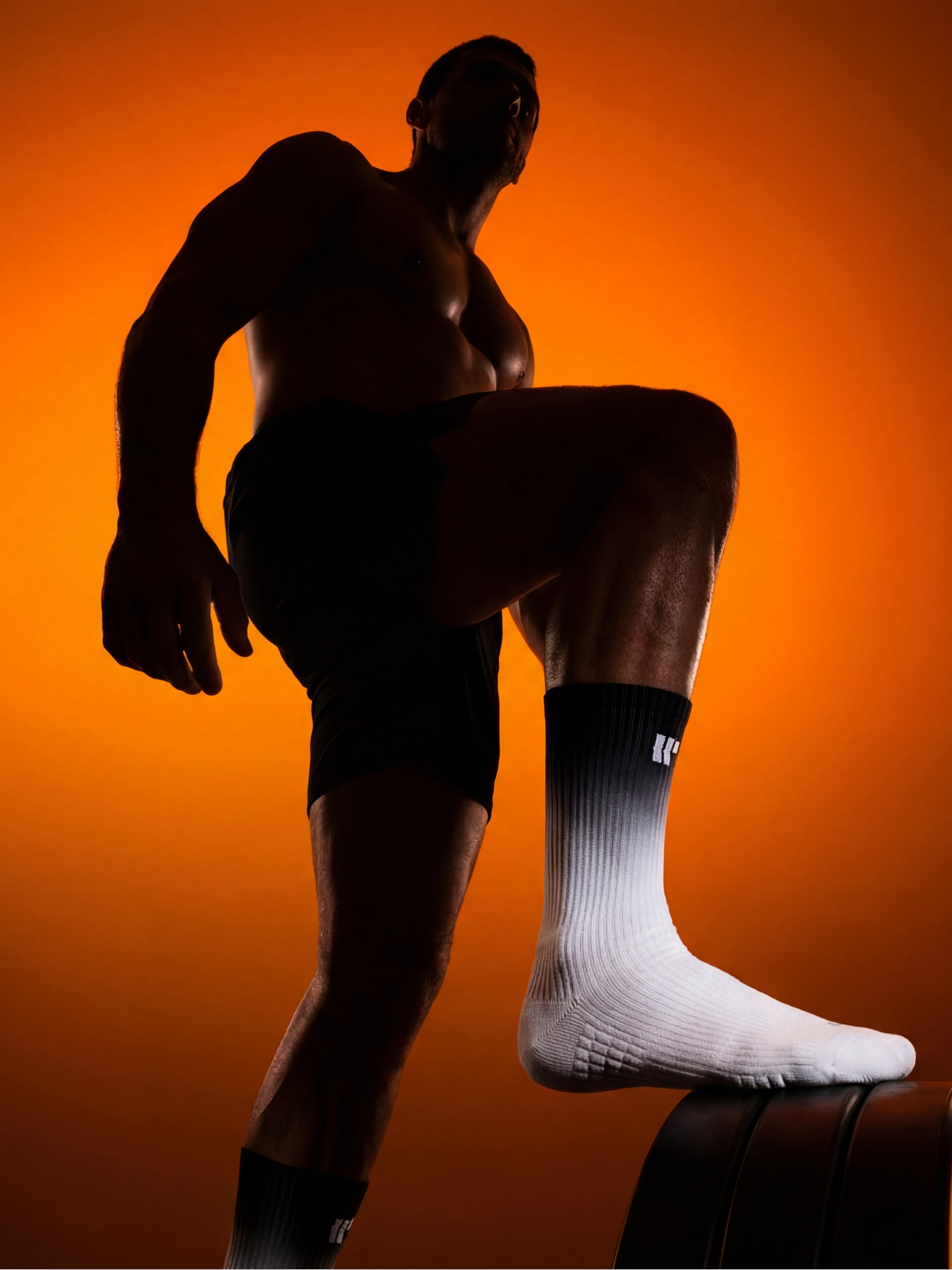
Wesocks Flowline. Compression socks engineered for blood flow, built for the long run. No gimmicks, no noise. Just what your legs actually need.
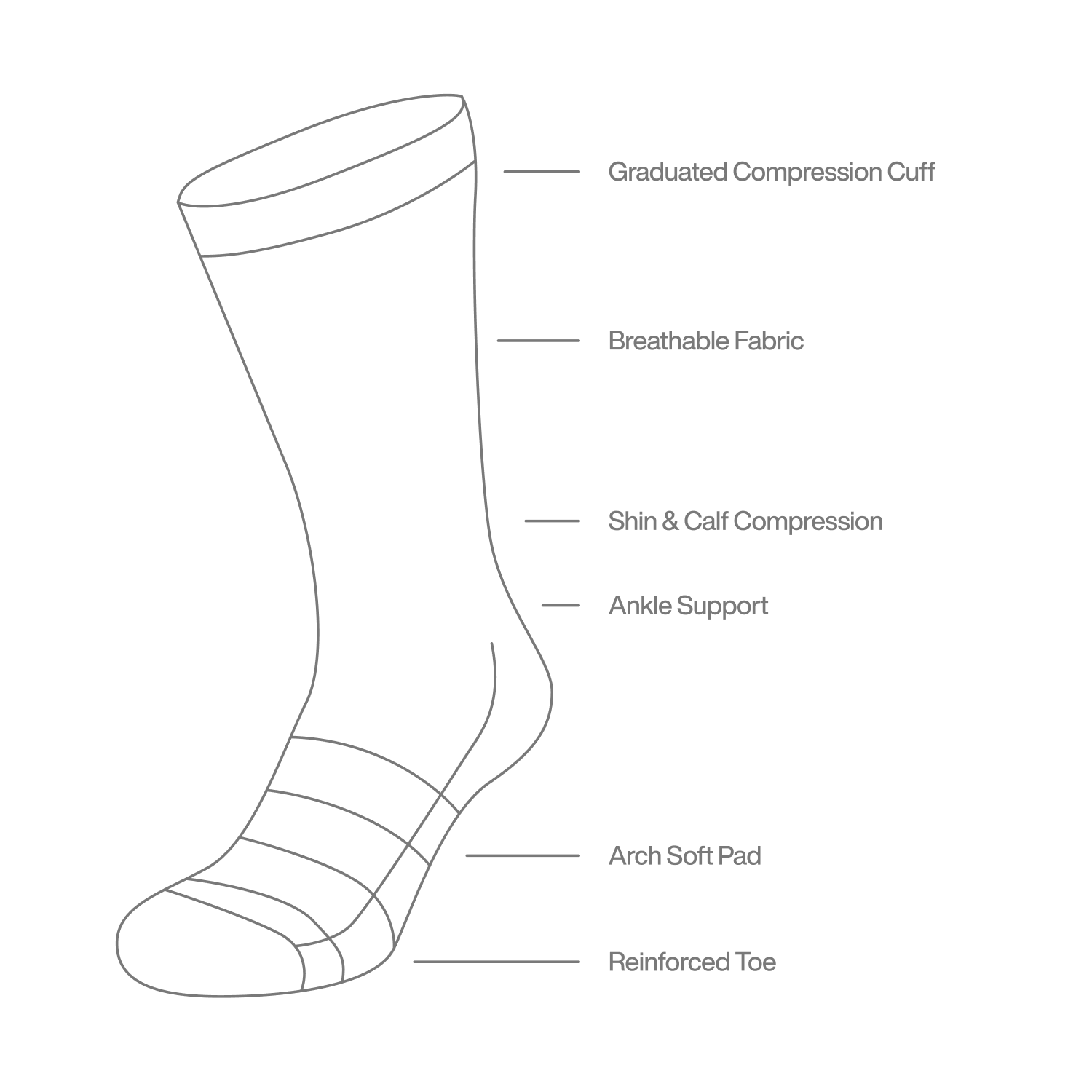
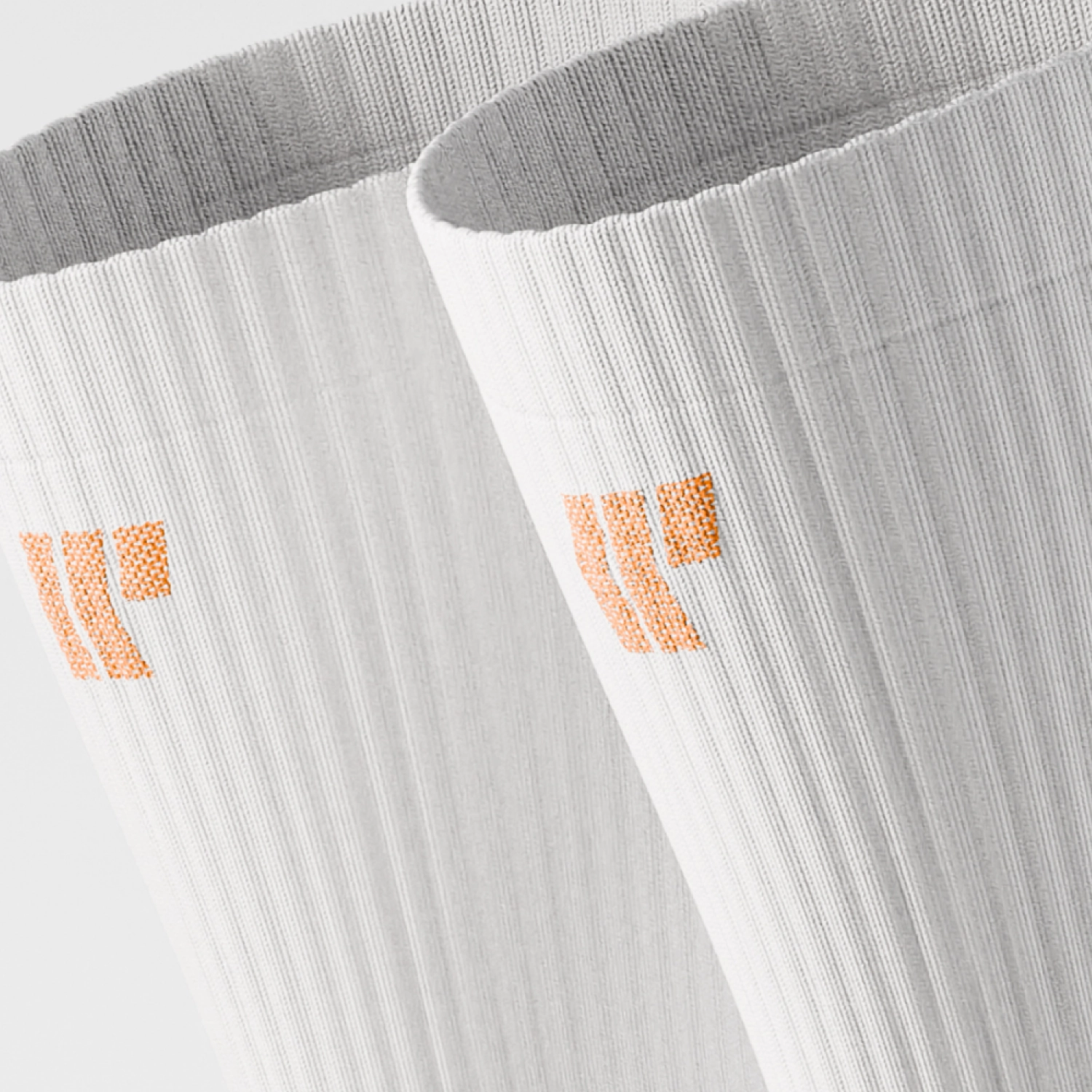
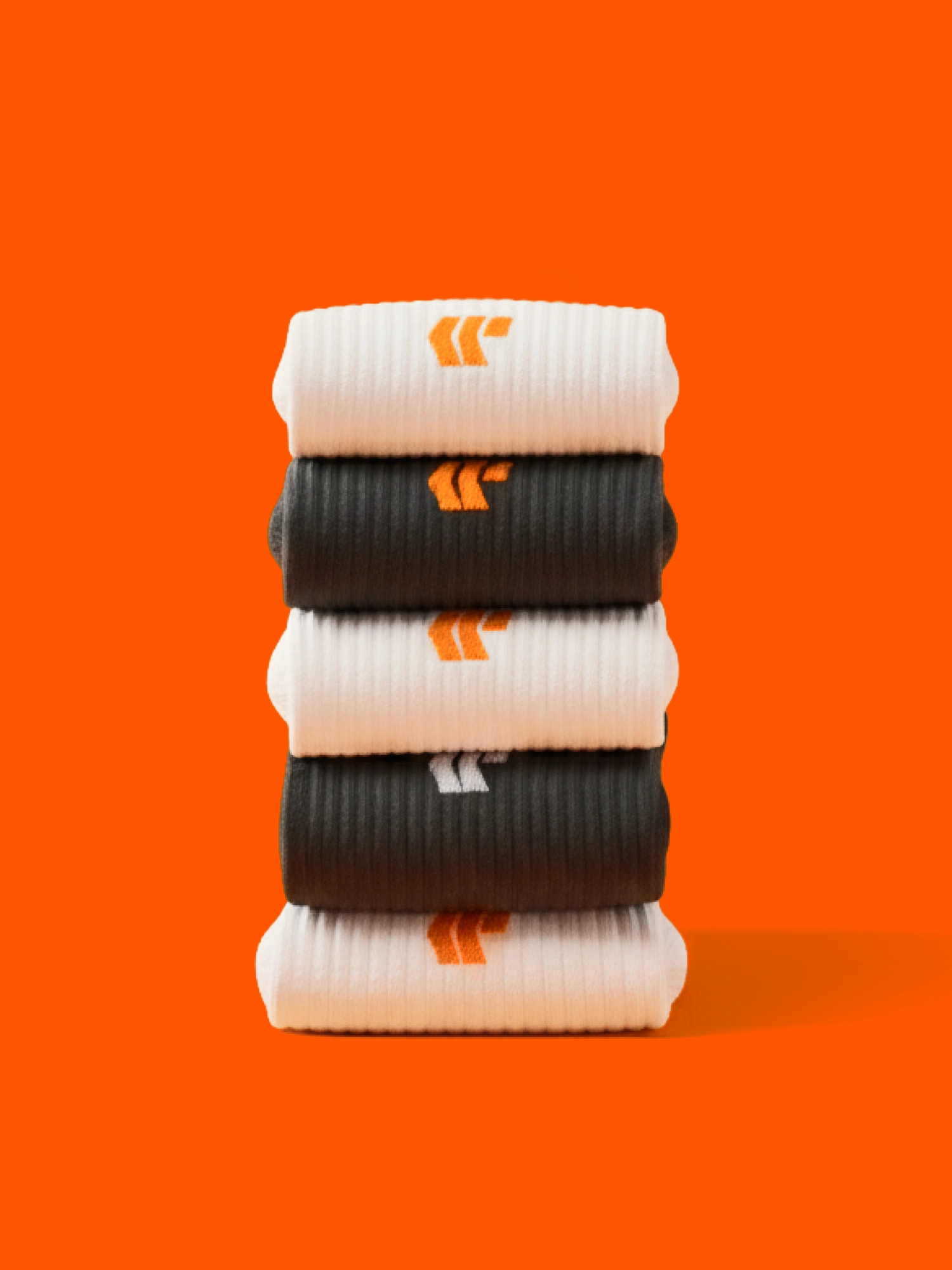
The product design focused on graduated compression zones that enhance circulation, reduce shin splints and muscle fatigue. Padded toe and heel for impact protection. Three colorways: Black, White, Orange, each tested across different running conditions and surfaces.
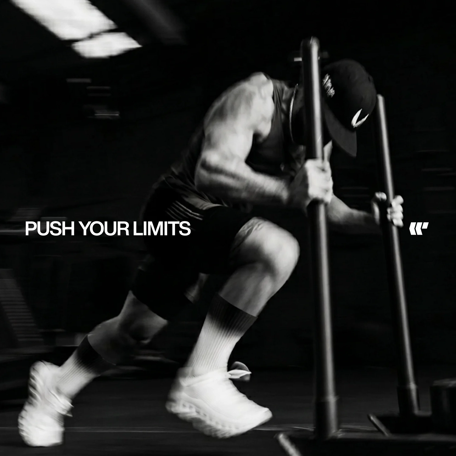
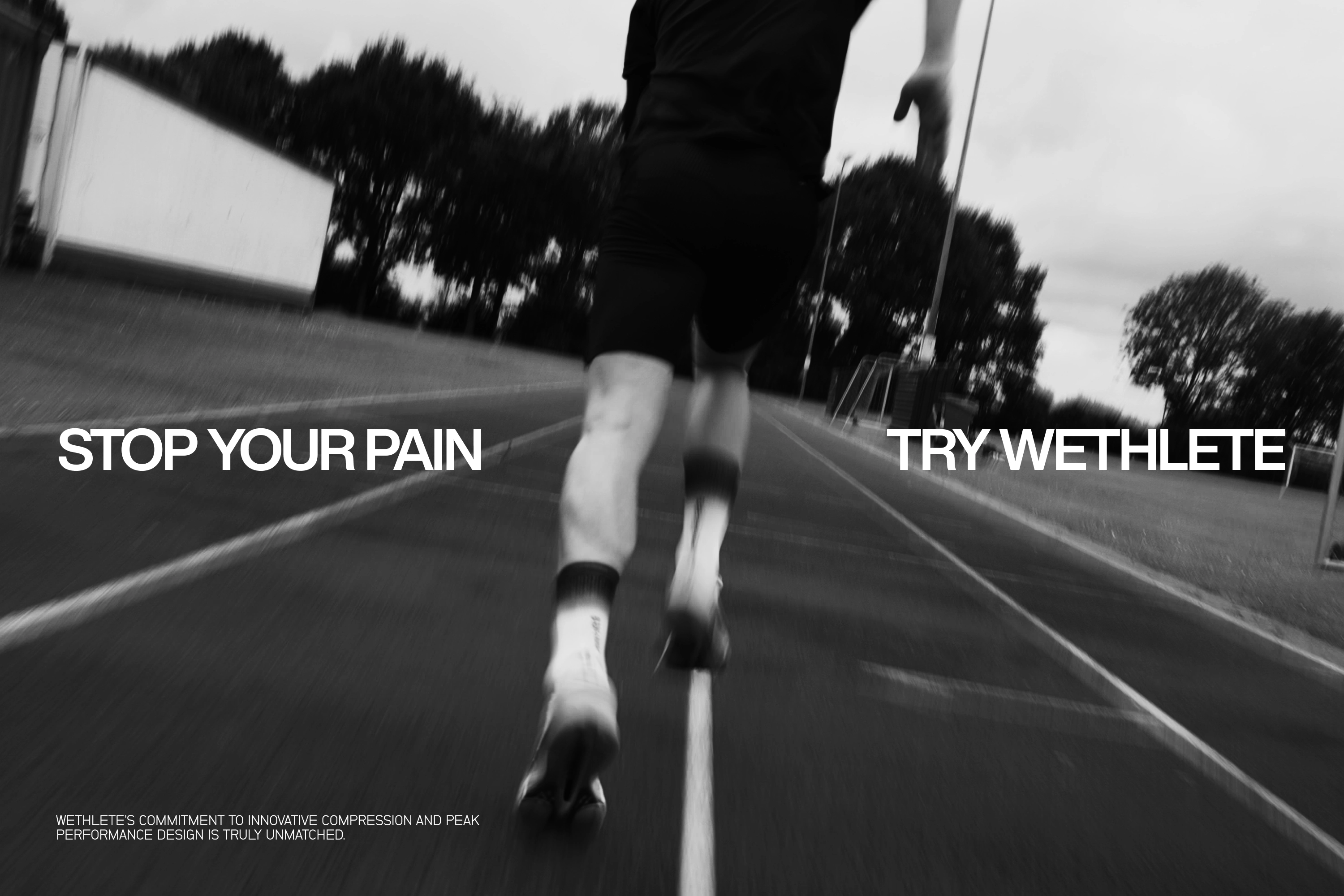
Stop your pain.
Try Wethlete.